Brand manual: why a logo isn't enough (and how a real one is made)
Jun 27, 2026
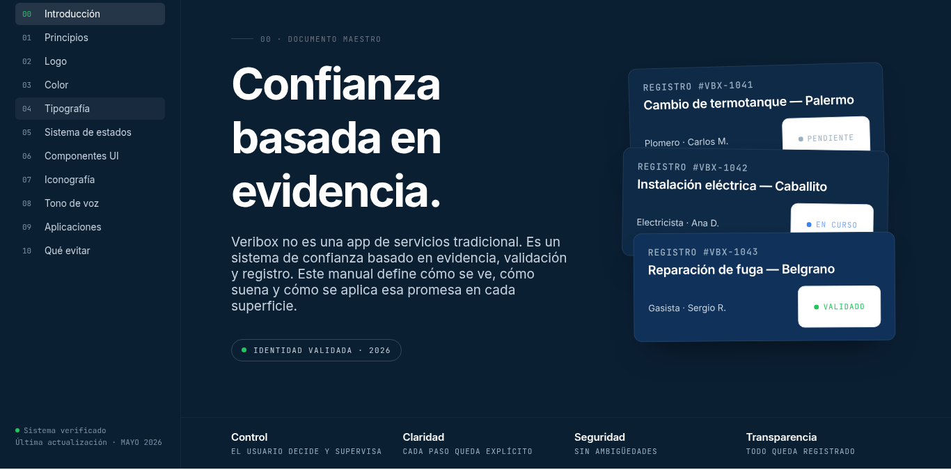
"I already have the brand", he told me. It was a logo.
"I already have the brand," he told me. And he sent me a PNG: his logo, on a white background, nothing else.
I see it all the time. Someone starts a project, pays for a logo, and thinks that's a brand. Three weeks later they come back with a problem they can't name: the website says one thing, Instagram another, the invoices another, and the whole thing conveys nothing. It's not a design problem. It's a brand without rules, and a brand without rules falls apart in the hands of the first person who touches it.
Here's the idea I want you to take away: a logo is not a brand. A brand is a system. People, deep down, don't remember a logo: they remember what's behind it. And the document that defines that "behind" is called a brand manual.
I'll explain what it is, what it must include and how it's made —but not in the abstract: I'll show you through a real one we built end to end, where you'll see something almost nobody tells: how every brand decision is born from the product.
A logo is not a brand: what a brand manual is
A brand manual, also called a brandbook, is the set of rules that defines your identity: the logo and how to use it, the colors, the typography, the tone you speak in and how all of that is applied.
The fastest way to get it is by what it is NOT. It's not a logo: the logo is one piece inside the manual, not the manual. It's not "the designer's file": it's a document so anyone —your team, a print shop, a new freelancer— can use your brand well without guessing. And it's not decoration: it's an operational tool, it exists so your brand doesn't change face depending on who touches it that day.
Think of it as the operating system of your identity: you define the rules once, and from then on everyone works within them. The logo is just the icon on the screen; the system is what's underneath.
Meet Veribox: an app that only exists if there is trust
So this doesn't stay theoretical, here's the case. Veribox is a platform to find home-trade professionals —plumbing, electricity, gas, HVAC, painting— you can actually trust. It was born from a concrete problem: in cities, when something breaks at home, finding someone reliable is a lottery of overcharging, no-shows and bad work. People don't look for the cheapest; they look for peace of mind.
Veribox's core decision changes everything: it's not an open marketplace. Not just anyone gets in. Every professional goes through a demanding validation —a detailed application, a written description of what they solve and what they don't, evidence of real jobs, and manual approval—. Curation over quantity. And once inside, the whole system revolves around the same idea: evidence. Every job has a digital contract, clear states (pending, in progress, finished), mandatory photo or video evidence to close it, and validation from both sides. The professional doesn't collect "likes": they build a verifiable track record that becomes the most important résumé of their career.
That's Veribox's promise in one line: trust based on evidence. Keep that phrase, because that's where the brand begins.
When the brand translates the product: the principles
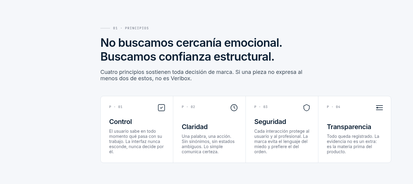
Here's what makes this manual unique. Most brandbooks start by choosing nice colors. Veribox's starts with a stance, written verbatim on the first page: "We don't seek emotional closeness. We seek structural trust."
From there come four principles, and notice they're not decorative words: they're the product described in one word each. Control: "the user knows at all times what's happening with their job" —that's the app's states and notifications—. Clarity: "every step is explicit" —that's the digital contract—. Security: "no ambiguities" —that's the validation—. Transparency: "everything is recorded" —that's the mandatory evidence—.
The manual says it plainly: "Four principles hold up every brand decision. If a piece doesn't express at least two of these, it's not Veribox." That's the difference between a real manual and a color palette: every visual decision has to earn its place against the strategy.
The color that only appears when something is true
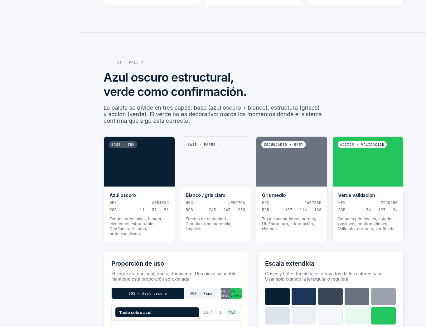
Look at the palette and you'll get what I mean. The block is titled, verbatim, "Structural dark blue, green as confirmation." It's not "these are our colors": it's a rule with meaning.
The dark blue (#0B1F33) is the base: it conveys solidity, structure, professionalism. And the green (#22C55E) has a single function, to confirm. It's not a decorative color spread around for taste; it appears only when the system says "this is validated, this is correct, this happened". It is, literally, the green of the VALIDATED state in the app.
See the move? The color doesn't illustrate the brand: it translates what the product does. In Veribox, trusting means something was verified, and the green is the visual face of that verification. That's why the manual even fixes the usage proportion —green is functional, never dominant— so the brand never over-celebrates. That's real coherence.
Two typefaces: one for people, one for what gets recorded
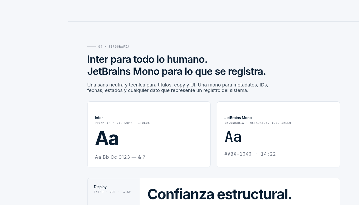
Another verbatim principle from the manual: "Inter for everything human. JetBrains Mono for what gets recorded."
Inter, a neutral, clear sans, is for what speaks to the person: titles, text, interface. And JetBrains Mono, that technical-looking monospaced typeface, is reserved for the data: record IDs, dates, states, receipts. Again, it's not an aesthetic whim. Veribox is a system that documents, and the typography tells that promise: when you see the mono, you know you're looking at a verifiable fact, not an opinion. The shape of the letters reinforces the idea that every job is logged.
The Funnel Box
Need a growth strategy?
Business consulting focused on real and sustained results.
Four states with no grays, and saying what happened
There are two more decisions worth seeing, because they nail the idea.
The first: "Four states. No in-between shades." In the app, a job is validated or it isn't; there are no gray zones or "almost". That decision, which looks like product, is also brand: it defines how everything is communicated, without ambiguity. A trust brand can't afford the "more or less".
The second is the tone rule, and it's my favorite: "We say what happened, not what we feel." It's the whole product condensed into how the brand speaks. Veribox doesn't sell feelings ("the best service!"); it shows facts: this job was done, here's the evidence, here's the history. Tone of voice isn't a friendly add-on to the manual: it's the promise, again, translated into words.
What Veribox is not (and why saying it matters)
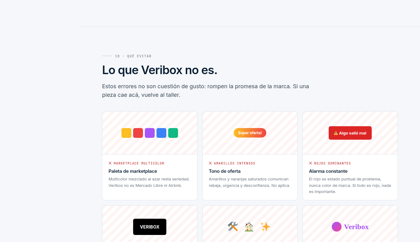
Good manuals don't only define what the brand is; they define what it is NOT. Veribox's closes with a whole section —"What Veribox is not"— with concrete anti-examples: it's not a multicolor marketplace palette, it's not the yellow of "super sale", it's not the red of constant alarm. Each one explains why it would break the promise.
That's not designer paranoia. It's what protects the brand when it grows and passes through ten different hands. Defining the limits is as important as defining the identity, because inconsistency is the fastest way to lose the trust that costs so much to build.
That's why a logo isn't enough
Go back to the founder from the start, the one with the PNG. His logo wasn't bad. The problem is that a logo can't carry any of this. It can't say "trust based on evidence", it can't make green mean "validated", it can't hold the tone when five different people write. A logo stays still; a brand holds.
Veribox wanted exactly that: to go from "just another app" to something the market recognizes and trusts at first glance. And that's not achieved with a pretty symbol, it's achieved with a system where every decision —color, typography, states, tone, even the stroke weight of an icon (the manual fixes a 1.6px outline)— pushes in the same direction. That's where a brand starts to identify, which is what you as the owner actually need.
Want a brand like that for your project?
If you're starting out, or if you feel your company needs a rebrand to start looking like what it is, here's what matters: don't ask for a logo. Ask for the system. Logo, color with meaning, typography with logic, tone and applications, all documented and, ideally, navigable online: not a PDF nobody opens, but a living reference your team and suppliers consult at a link and that stays updated. Veribox's is exactly that.
That's what we do at The Funnel Box: we don't hand over a logo, we build the complete brand system your business needs to look —and stay— professional. If you want, let's talk: in a consulting session with us we look at your brand and see what it needs to stop being a logo and start being a brand.
Frequently asked questions
Are a brand manual, a brandbook and a style guide the same thing? In practice, yes: different names for the document that defines and governs your identity.
Are a brand manual, visual identity and brand management the same? No, and it's worth not confusing them. Visual identity is the visible part (logo, colors, typography). The brand manual is the document that governs that identity and adds strategy and tone of voice. And brand management is the ongoing work of applying that manual and keeping everything coherent over time. The manual contains the visual identity; management is using it day to day.
Does a small or new brand need a manual? Yes, more than a big one, because it has less room to look improvised. The sooner you define your rules, the sooner you start looking consistent and professional.
Can I do it myself with a template? A basic version, yes. The difference of a professional manual is two things: the strategy behind it (so every decision has a why, like Veribox's green) and the system (so it holds up as you grow). That doesn't come from a template.
How often is it updated? When the brand evolves or the pieces start drifting from the system. That's why a manual that's navigable online is so practical: you update it once and everyone sees the latest version.
Written by
Gonzalo Castro
Founder of The Funnel Box · OpenAI Select Partner
Business and artificial intelligence consultant. I accompany companies from within to build growth systems that are sustained over time.
